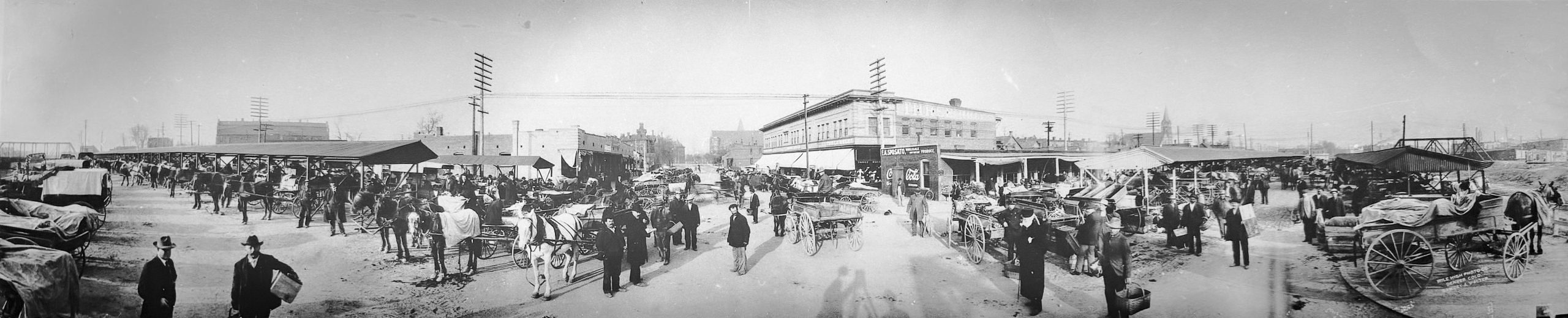
Panoramic black and white photo of Denver’s Denargo Market early in the 1900s, with horse-drawn wagons, produce vendors, and city buildings in the distance.

Nostalgic Confections

Confectionally Yours Journal

Confectionally Yours Journal

Nostalgic Confections Studio

The Studio

Notes, studies, and images from the working archive. This space gathers the visual and creative explorations that shape Nostalgic Confections behind the scenes. Some images mark beginnings, others document experiments, influences, or moments of quiet discovery along the way. Rather than finished statements, these entries reflect an active studio practice — observations made at the bench, ideas taking form, and the ongoing dialogue between craft, memory, and visual intelligence. We are archaeological listeners here, drawn to what these anonymous frames still have to say about being human, being present, being seen.

Here, the work is still unfolding.

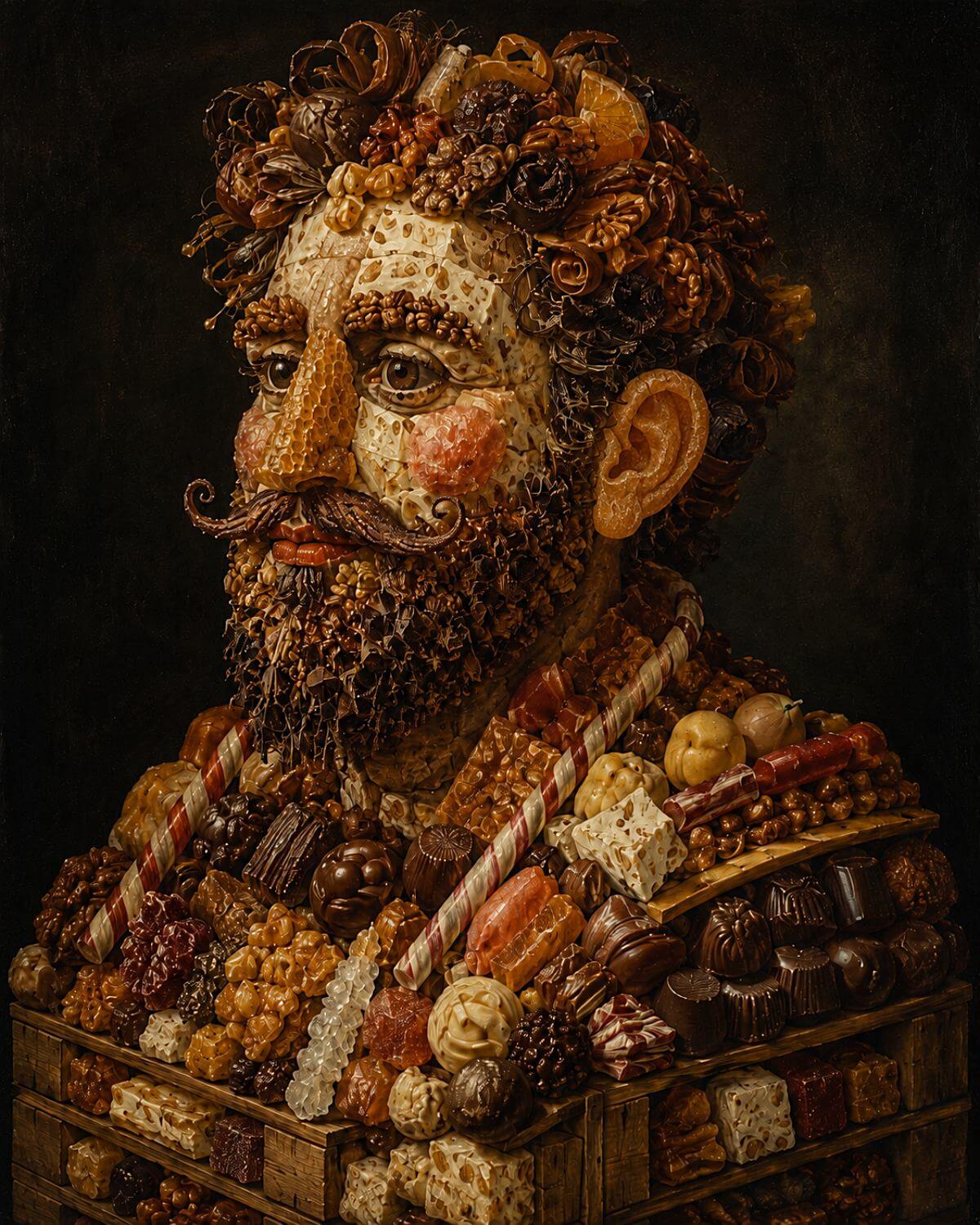
  • Composite portrait of a bearded man in three-quarter view against a dark painterly background, built from confections and candy materials. The face includes pale nougat planes with visible nut inclusions, a honeycomb nose, brows and hair made from nut halves, chocolate curls, and confectionery forms, and a candied-peel ear. Below the shoulders, the figure resolves into an arrangement of hand-dipped chocolates, nougat pieces, marzipan fruits, nut clusters, ribbon candy, and red-and-white barber-pole sticks resting on a wooden crate structure.

    “A Man Built From His Own Trade”

    Look closely and the face resolves the way an Arcimboldo always does — slowly, then all at once. A honeycomb nose. An ear of candied peel. Nut halves for the brows, chocolate curls and fragments massed into hair and beard. Below the collar the man stops pretending to be flesh and simply becomes the shop: hand-dipped chocolates, nougat, marzipan fruit, ribbon candy stacked into the ordered abundance of a working display. It is a portrait of a confectioner built entirely from his own trade — a man assembled from the things he has made, cut, dipped, stacked, and sold.

    The idea is older than it looks. Giuseppe Arcimboldo spent a quarter century at the Habsburg courts, painting sovereigns as harvests and seasons in an age when spectacle, allegory, and display were part of political life. What’s often forgotten is that he shared those courts with another kind of maker — the confectioners who modeled triumphs and figures from sugar paste and almond, marvels built to be admired for one evening and then broken apart and cleared away. The painter’s name survived because paint survives. The sugar sculptor’s did not. Our new piece on the Palimpsest reopens that old conversation between the named artist and the unnamed maker.

    We’ll also tell you where the image fell short of what we intended — because it did. In a true Arcimboldo composite, nothing is exempt; even the eyes must be made of something else. Here the generative tool couldn’t quite let go of ordinary anatomy, and it left us two recognizably human eyes staring out of a face made of candy. Rather than retouch them into submission, we’ve left them as they are: evidence, not embarrassment, and the reason this piece marks the point where we begin naming our tools plainly.

    Image © Nostalgic Confections Creative Studio, 2026

    Studio Original (Interpretive Imagery). Editorial authorship & compilation rights. For usage context and visual standards, pair this entry with the project’s current stewardship guidance.

    Creativity & Conceptualization

    The project began with an art-historical anchor rather than a visual one. Arcimboldo’s composite heads were to supply the compositional logic — a figure genuinely built from materials rather than decorated with them — and the first honest read of the brief was that it was too generous to survive generation. A long ingredient list handed to an image studio becomes an ingredient dump, and an ingredient dump is decorative. So the freedom was narrowed before anything was made: one subject, mature and male, bust-length in three-quarter view, and a fixed count of confection elements rather than every sweet a shop might carry.

    The discipline that mattered most was anatomical. Ingredients were assigned to structure by family — soft pale confections for the facial planes, nuts for the brows, a single tapered sweet for the nose, chocolate and coconut for hair and beard, and the shop’s own display work for collar and torso — so the face would stay readable at a distance while rewarding a close look. The crate-slat base came from the same instinct: a composite figure needs something to rest on, or it floats. The period question was settled in the middle. He carries an old-master bust posture without Renaissance costume, because a literal sixteenth-century figure would have lost the mid-century confectionery identity, and a modern one would have lost the gravity that makes the double-reading work at all.

    The image fell short in one place, and it is the place a purist looks first. In a true composite nothing is exempt — the eyes must be made of something too, and the brief asked for chocolate with white accents. The tool would not give up ordinary anatomy, and it returned two human eyes in a face otherwise assembled entirely from candy. Retouching them was possible and was declined. What remains is a record of where the tool’s habits overrode the brief, which is more useful to keep than a seamless picture would have been — and it is the piece where this studio began naming its tools plainly rather than quietly.
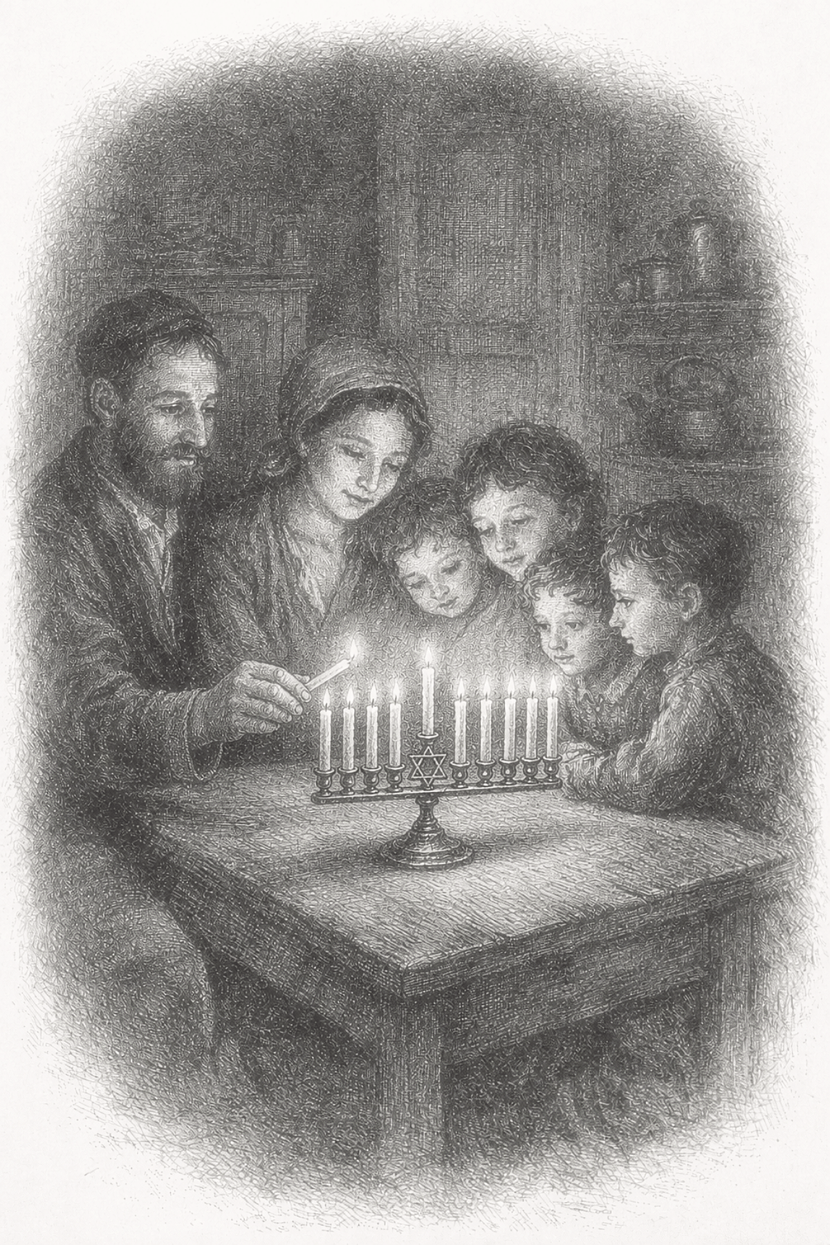
  • A woodblock-style black-and-white illustration depicting a Jewish family seated closely around a rectangular wooden table inside a modest interior room. Shelving and household objects are visible in the background, suggesting a domestic setting. The illustration uses dense cross-hatching, soft edges, and a dark vignette around the scene, with the table and figures forming the central focus.

    “Family Lighting a Menorah”

    This image depicts a quiet Hanukkah evening within a modest nineteenth-century Jewish home, where a family gathers closely around the table as the menorah is lit. The parents and children are drawn together not by spectacle, but by ritual — a shared moment of devotion, warmth, and attention. The composition centers the act of lighting as both a spiritual observance and an intimate family experience.

    Rendered in a restrained monochrome style inspired by historical woodblock and engraving traditions, the image emphasizes stillness, closeness, and domestic sincerity. The candlelight becomes the emotional focal point, illuminating the faces of the family as they lean inward together. The simplicity of the room and furnishings supports the scene’s authenticity, allowing the meaning of the ritual to remain central.

    Created by Nostalgic Confections Studio using creative intelligence, this work is contemporary interpretive imagery rather than a reproduction of any single historical artwork. It was made in recognition that the social and cultural fabric of nineteenth-century life was more diverse than it is often represented to be. By depicting a Jewish family within a historical visual language more commonly associated with Christian domestic scenes, the image seeks to acknowledge a broader and more inclusive American past.

    Image © Nostalgic Confections Creative Studio, 2026

    Studio Original (Interpretive Imagery). Editorial authorship & compilation rights. For usage context and visual standards, pair this entry with the project’s current stewardship guidance.

    Creativity & Conceptualization

    The ideation for this image began with a simple but important question: how might a nineteenth-century domestic holiday scene be expanded to reflect the fuller diversity of family life and faith traditions in that period? While historical American woodblock and engraving imagery often centered Christian holidays and customs, we felt it was meaningful to create a parallel image honoring Hanukkah within the same visual vocabulary. The goal was not novelty, but recognition — to suggest that Jewish families, too, belonged within the lived social world of the nineteenth century.

    From the outset, the emotional register was defined as familial warmth, gentle reverence, and quiet joy. Rather than constructing a complex narrative, the composition was built around the act of candle lighting itself, with each family member drawn into the circle of attention. The modest interior, close grouping of figures, and softened monochrome treatment were all chosen to support the sense of ritual intimacy. Care was taken to keep the scene historically grounded and emotionally legible without turning it into sentiment or pageantry.

    In rendering the image, the emphasis remained on restraint and cohesion. The engraving-like linework, diffused tonal field, and open vignette were used to evoke a historical print sensibility while preserving the human tenderness of the scene. The menorah and candlelight serve as the visual anchor, but the true subject is the family’s shared attention — the stillness that gathers around observance, memory, and belonging. In this way, the image becomes both an homage to historical print traditions and an effort to widen the cultural frame through which those traditions are imagined.


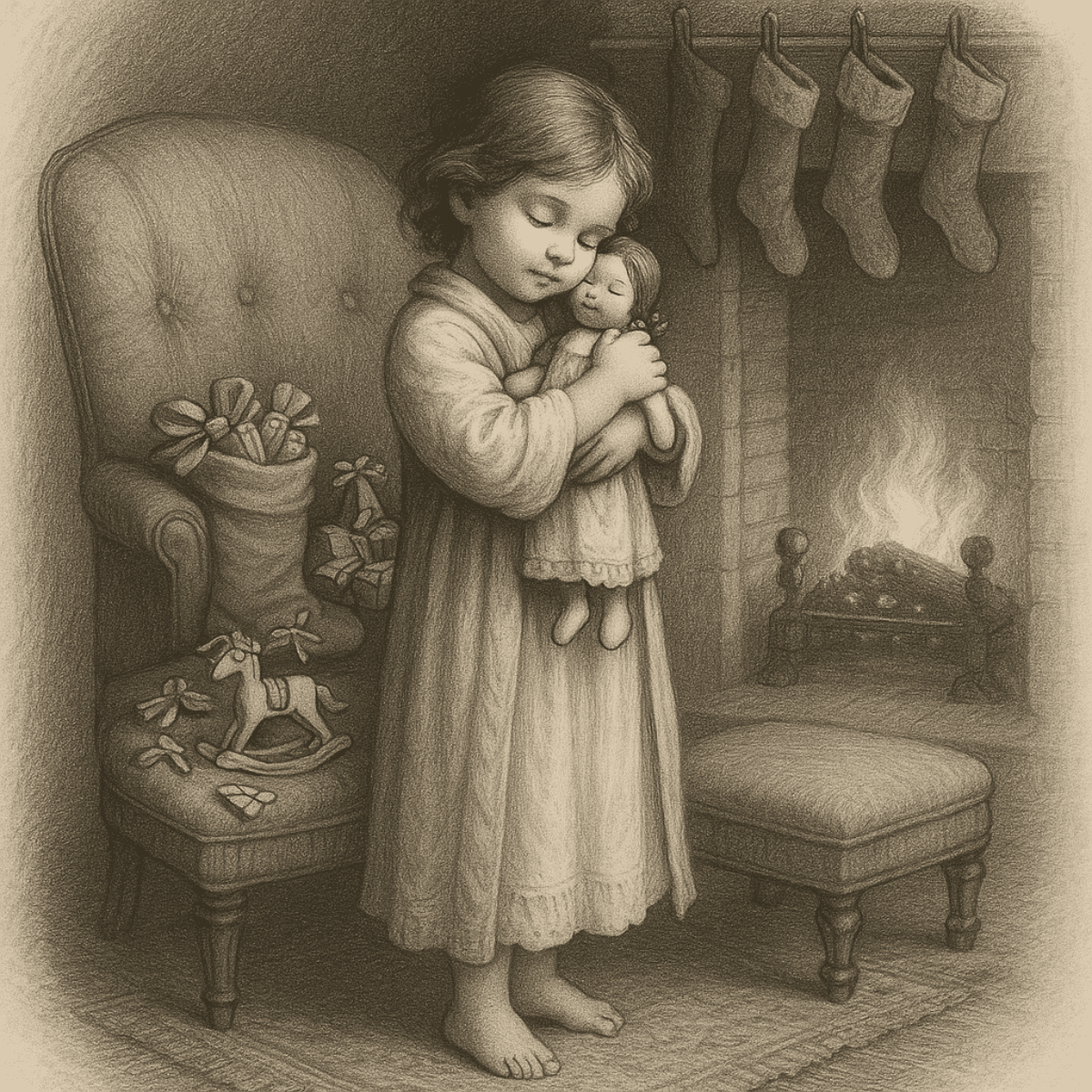
  • A barefoot child stands near a fireplace, gently holding a doll, with stockings hanging from the mantel.

    “Child Holding a Doll by the Hearth”

    This image presents a quiet Victorian domestic interior rendered in a woodblock-inspired style. A young child stands barefoot beside the hearth, gently cradling a simple doll against her chest. Her eyes are closed, not in sleep but in absorption — a moment of complete presence. Behind her, four stockings hang from the mantel, suggesting a household that values ritual and togetherness over excess.

    The surrounding objects are modest and carefully placed: a high-backed upholstered chair holding a filled stocking and ribboned gifts, a small rocking horse on the floor, and a low ottoman positioned near the fire. Each element is rendered with deliberate restraint, echoing the visual economy of late 19th-century printmaking, where meaning emerged through suggestion rather than abundance. The softened edges, open background, and subtle grain recall the tactile qualities of traditional woodblock and engraved illustration, while the composition itself emphasizes emotional sufficiency rather than spectacle.

    The image reflects a historical truth often overlooked — that material simplicity and emotional richness have long coexisted, particularly within the intimate spaces of home. Created by Nostalgic Confections Studio using creative intelligence, this work is a contemporary image inspired by historical craft traditions, not a reproduction of any single historical artwork.

    Image © Nostalgic Confections Creative Studio, 2026

    Studio Original (Interpretive Imagery). Editorial authorship & compilation rights. For usage context and visual standards, pair this entry with the project’s current stewardship guidance.

    Creativity & Conceptualization

    This image began with a quiet domestic truth: material simplicity does not diminish emotional richness. The scene centers on a young girl holding a newly received doll beside a winter hearth, surrounded by modest gifts and familiar household objects. Rather than emphasizing abundance, the composition focuses on the child’s inward response—the private tenderness of holding something cherished for the first time.

    The rendering was shaped through historical visual traditions, particularly the softened linework, tonal restraint, and open vignette associated with nineteenth-century engraving and graphite illustration. Attention was given to posture, facial calm, and the physical closeness between child and doll, allowing affection to emerge through gesture rather than exaggerated expression. The fireplace, upholstered chair, stocking, and small toys establish the period atmosphere while remaining secondary to the emotional center.

    Its purpose is to honor the patience and intimacy of historical craft while reflecting a lasting human experience: that a simple object, received with wonder and held with care, can become inseparable from memory.


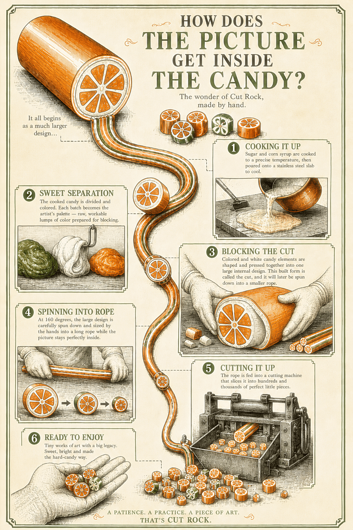
  • Vertical infographic explaining the general process of Cut Rock hard candy with illustrated stages showing cooking the candy base, separating colored portions, blocking the large internal design, spinning the design into a smaller rope, cutting the rope into pieces, and the finished candies in hand. The poster uses an orange-slice style example to show how a large internal image becomes many small matching candies.

    “The Picture Inside the Candy”

    The poster follows Cut Rock from raw sugar to finished piece in six stages, connected by a single continuous rope of candy that winds down the page like the candy itself winds down from a large mass to a small one. It opens with cooking — sugar and corn syrup brought to temperature in a copper kettle, then poured out to cool. From there the cooked batch is divided and colored, each portion becoming what the infographic calls the artist’s palette: raw, workable lumps ready to be shaped into a design.

    The center of the piece is blocking — colored and white candy pressed and shaped by gloved hands into one large internal design, built at a scale a person can hold in both arms. This is the step that determines everything: whatever picture lives at the heart of that mass is the picture every finished piece will carry. From there the design is spun down, narrowed under careful hand work into a long rope while the image at its center holds its shape and proportion, shrinking without distorting. The rope is then fed into a cutting machine, sliced into hundreds of identical pieces, each one revealing the same picture in miniature — in this case, an orange slice, chosen as a clear, familiar example of how the design travels intact from the large block down to a single piece the size of a thumbnail.

    The infographic closes on an open hand holding several finished pieces, a small, quiet image after five stages of heat, muscle, and precision. Throughout, the poster is illustrated in a vintage engraving style, deliberately evoking the era when this kind of hand-blocked candy work was common practice rather than a rarity — a visual choice that places the technical process inside the same craft lineage the accompanying essay is about.

    Image © Nostalgic Confections Creative Studio, 2026

    Studio Original (Interpretive Imagery). Editorial authorship & compilation rights. For usage context and visual standards, pair this entry with the project’s current stewardship guidance.

    Creativity & Conceptualization

    This infographic went through three coordinated AI studios — concept, prompt, and image generation — and two full rounds of correction before it was ready to publish. The first version was aesthetically striking but technically wrong in ways that mattered: bare hands working candy at 160 degrees, a marble slab where our own production uses stainless steel, a blocking panel that showed assembly rather than the sculptural shaping the process actually requires. Getting the vintage engraving style right was the easy part. Getting the craft right took real correction work, cross-referenced against a 1983 Hammond’s booklet, a set of 1960s Hammond archival photographs, and forty years of hands-on memory.

    The hardest single panel was Block 3, Blocking the Cut. Every image generator we tried struggled to render the actual geometry — a large unified mass of colored candy shaped and pressed into an internal design, not rods or pieces being assembled like components. We produced a standalone reference illustration of that cross-section that we’re genuinely proud of, but integrating it into the full infographic without disturbing the rest of the composition proved to be beyond what the current tools could do reliably. We made the call to keep the existing panel rather than risk the piece’s overall cohesion, and treated the gloves, the terminology, and the copy as the corrections worth fighting for.

    What we learned matters as much as what we produced. Dense, multi-panel infographics with embedded text and panel-specific edits sit at the outer edge of current image generation — closer to restoration work than simple illustration. Our own image studio rated this piece a 9 out of 10 in difficulty. Six hours of collaborative correction later, we landed on something we’re willing to put our name on: publishable, technically honest, and faithful to a process that very few people alive still know how to do by hand.


  • Vintage-style illustration of two badger hair brushes labeled No. 1 and No. 2 used for finishing chocolate surfaces.

    “Badger Hair Brushes”

    Badger-hair brushes have long been valued across multiple crafts — including painting, gilding, and restoration — for their exceptionally soft, fine-tipped bristles. Their ability to make extremely light contact without abrasion made them suitable for delicate surface work.

    In confectionery practice, particularly in the late 20th and early 21st century, similar brushes were occasionally used to refine finished chocolate. Rather than polishing to a gloss, the technique subtly redistributed surface cocoa butter, reducing minor scuffs or inconsistencies and creating a more uniform matte or satin appearance.

    Image © Nostalgic Confections Creative Studio, 2026

    Studio Original (Interpretive Imagery). Editorial authorship & compilation rights. For usage context and visual standards, pair this entry with the project’s current stewardship guidance.

    Creativity & Conceptualization

    This image emerged from a study of how tools carry both function and quiet authorship within craft traditions. Rather than approaching the brushes as decorative objects, the concept was grounded in their role within early confectionery work—practical instruments used to apply chocolate finishes with control and subtlety. The intention was to present them not as products to be admired, but as implements to be understood. This shift in framing guided the image toward the visual language of early supply-house catalogs, where clarity, material truth, and utility were prioritized over persuasion.

    The creative process unfolded through a collaborative exchange that emphasized restraint at every stage. Conceptual framing established the historical and functional context, while prompt architecture translated those ideas into a disciplined visual structure. Each iteration avoided embellishment, instead refining proportion, surface quality, and line behavior so the objects could hold their own authority. The decision to adopt an object plate format—rather than a scenic composition—allowed the brushes to exist in isolation, supported only by the faintest suggestion of their working environment.

    This approach reflects a broader philosophy of creative collectivity, where image-making is guided through dialogue rather than singular direction. Narrative intent, technical constraint, and visual sensitivity were held in balance, allowing the final image to feel less like a constructed illustration and more like a recovered artifact. In this way, the brushes become more than tools; they stand as a quiet record of the craft practices they once served, rendered with care, precision, and an intentional absence of excess.


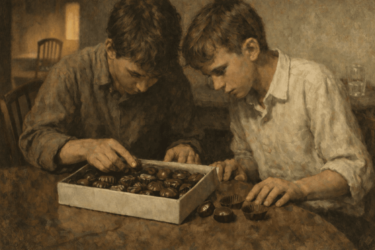
  • Painterly illustration of two boys leaning over an open box of assorted chocolates, poking the underside of the pieces with their fingers to find out what filling is inside.

    “The Puncture Test”

    Two boys examine a box of chocolates, testing pieces to discover the hidden fillings — a childhood puzzle that echoes the confectioner’s internal system of chocolate identification marks.

    Painterly illustration depicting two boys leaning over an open box of assorted chocolates while attempting to identify the fillings by puncturing the bottoms of the pieces.

    The scene visualizes the opening anecdote of the Palimpsest essay “The Puncture Test,” where childhood curiosity encounters the long-standing mystery of the assorted chocolate box.

    Image © Nostalgic Confections Creative Studio, 2026

    Studio Original (Interpretive Imagery). Editorial authorship & compilation rights. For usage context and visual standards, pair this entry with the project’s current stewardship guidance.

    Creativity & Conceptualization

    This image emerged from an exploration of quiet human behavior within ordinary domestic life. Rather than beginning with a finished visual concept, the process started with a simple narrative observation: children often approach small acts of mischief with the seriousness of a scientific procedure. The central idea became two boys studying a box of chocolates not as indulgence, but as a problem to solve. The scene intentionally avoids overt humor or sentimentality; instead it invites the viewer to notice the logic of the moment slowly. What first appears as simple concentration gradually reveals a small, carefully managed disruption of order.

    The visual construction of the image was shaped through a collaborative studio dialogue that balanced narrative framing, prompt architecture, and iterative visual generation. Each stage focused on restraint. Rather than adding expressive cues, the process relied on subtraction and subtle evidence — disturbed liners, chocolates set aside, and faint signs of testing — to allow the story to emerge indirectly. This method treated the image less as illustration and more as a moment discovered mid-action, where meaning develops through attention rather than explanation.

    Creative collectivity played a central role in shaping the final composition. Narrative guidance ensured the emotional tone remained sincere and observational, while prompt design translated that intent into visual structure. Revisions were intentionally incremental: small adjustments to objects, gestures, and spatial relationships allowed the image to accumulate evidence of the boys’ ritual without disrupting the calm surface of the scene. The result preserves the children’s seriousness while allowing the humor to arrive only after the viewer recognizes what is happening.

    In this way, the image functions as both a narrative study and a reflection on collaborative image making. The process demonstrates how generative tools, when guided through deliberate conversation and curatorial discipline, can produce scenes that feel less like inventions and more like rediscovered moments. The boys’ quiet experiment with the chocolates becomes a metaphor for the creative process itself — careful testing, small revisions, and the gradual uncovering of meaning hidden beneath an apparently simple arrangement.


  • A woodblock-style black-and-white illustration showing an adult man and two children walking through a snowy wooded landscape. The adult man walks at the front, wearing a long coat and hat, and carries a hand saw over his shoulder. Behind him, a young child pulls a small evergreen tree tied with rope, while another child follows carrying a bundle of evergreen branches in their arms. Snow falls steadily across the scene, and bare trees line the background. A small dog walks alongside the group near the front. The figures move along a snow-covered path, with footprints visible beneath their feet. The illustration uses fine cross-hatching, soft shading, and a light vignette that fades into the surrounding winter landscape.

    “Family Bringing Evergreen Home in the Snow”

    The scene unfolds mid-journey rather than at its destination. Figures lean slightly forward against the cold, their movement unified by purpose rather than urgency. The adult’s steady stride contrasts with the children’s careful handling of branches and rope, revealing learning through participation rather than instruction.

    Snow creates quiet continuity across the landscape, reducing distraction and emphasizing gesture. Bare trees frame the group without enclosing them, allowing the viewer to sense distance traveled and distance remaining. The evergreen itself becomes both object and symbol — not decorative yet, but already meaningful through effort.

    Rather than presenting nostalgia directly, the image reflects the rhythm of tradition: preparation first, celebration later. Memory forms here in motion — in cold hands, shared responsibility, and the anticipation of returning home together.

    Image © Nostalgic Confections Creative Studio, 2026

    Studio Original (Interpretive Imagery). Editorial authorship & compilation rights. For usage context and visual standards, pair this entry with the project’s current stewardship guidance.

    Creativity & Conceptualization

    This image grew out of a real seasonal memory — the familiar ritual of driving into a national forest, choosing a tree together, and carrying it home through cold air and quiet excitement. Rather than recreating a specific historical scene, the goal was to translate the feeling of that experience: the shared work, the anticipation, and the small sense of accomplishment that comes with bringing something living back for the holidays.

    Early renderings leaned heavily into traditional woodblock detail, which unintentionally gave the figures a harder, more laborious expression than the memory itself held. Through revision, posture and atmosphere were softened so the scene reflected calm purpose rather than strain. The dog’s proportions were carefully adjusted as well, restoring a natural balance within the group and reinforcing the sense of companionship that belongs to moments like these.

    Light snowfall and layered depth remained constant throughout the process, helping guide the viewer forward with the family as they move through the landscape. The finished image holds both effort and warmth — a quiet portrayal of seasonal preparation, and of traditions passed not through instruction, but through simply doing them together.


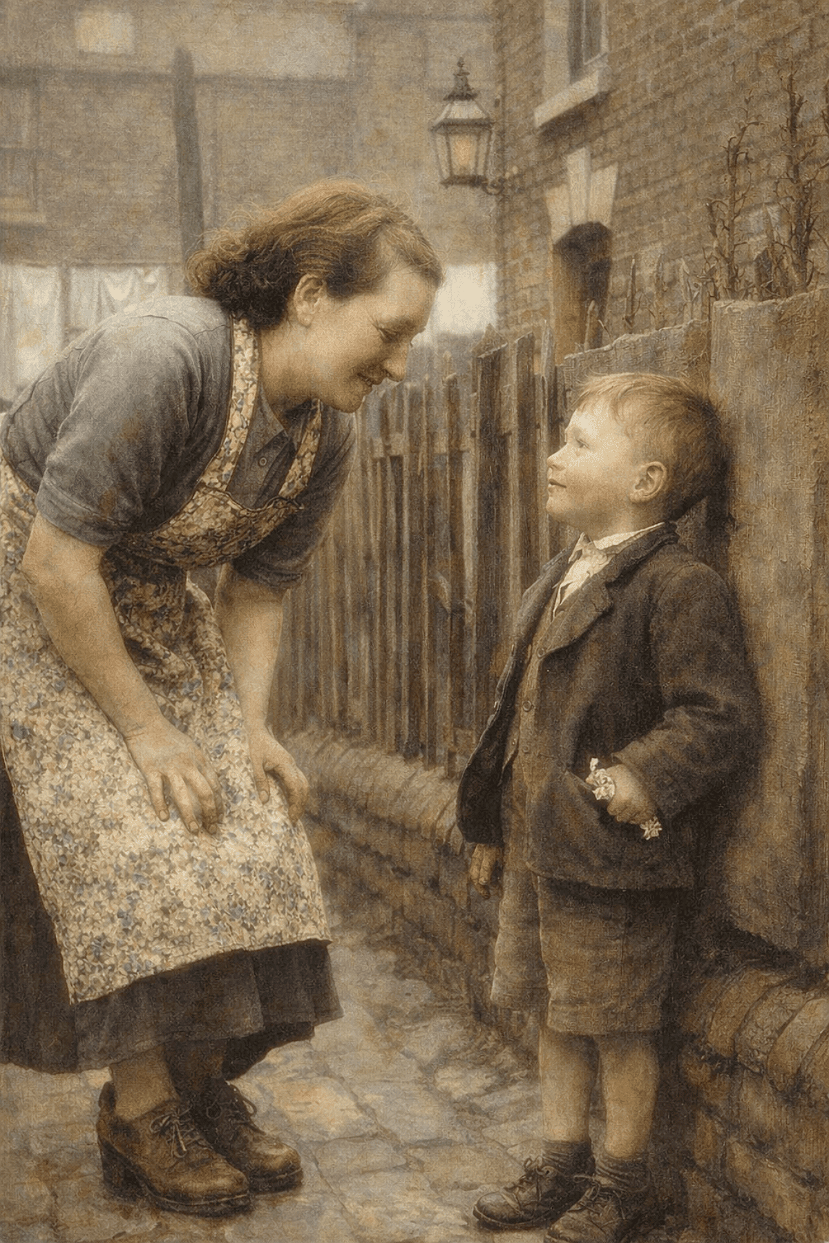
  • A softly painted scene on a narrow brick-lined street. A young child stands holding out a small object in his hand toward a woman who bends toward him, her attention entirely on the exchange. A wooden fence and weathered brick fill the background.

    “A Small Offering”

    A softly rendered, painterly image depicting a young child standing along a narrow brick-lined street, offering a small object held gently in his hand to a woman who bends toward him with quiet attentiveness.

    The setting is modest and enclosed, with weathered brick, a wooden fence, and muted architectural details creating a sense of familiarity and lived experience. The figures are positioned in close proximity, their interaction defined more by posture and presence than overt expression.

    The scene captures a brief and unembellished moment of connection — one rooted in recognition, care, and the everyday rhythm of human exchange.

    Image © Nostalgic Confections Creative Studio, 2026

    Studio Original (Interpretive Imagery). Editorial authorship & compilation rights. For usage context and visual standards, pair this entry with the project’s current stewardship guidance.

    Creativity & Conceptualization

    This image returns to the earlier foundation of the series — a quiet exchange between child and adult — but refines it with greater attention to emotional realism and restraint. The intent was not to create a sentimental moment, but to capture something more ordinary and believable: a child pausing to offer a small, imperfect gesture, and a mother meeting that moment with warmth rather than surprise. The setting, a narrow brick-lined street, was chosen to support this intimacy — enclosed, familiar, and lived-in rather than picturesque.

    The composition developed around body language rather than expression alone. The mother’s posture — bending slightly forward, grounded and attentive — creates a natural point of connection, while the child remains steady, almost formal in stance. The small detail of what he holds, partially concealed in his hand, reinforces the idea of a modest offering rather than a staged gift. Care was taken to avoid idealization: clothing remains simple, proportions natural, and the interaction understated so the moment feels observed rather than constructed.

    Rendering focused on achieving a soft, painterly realism that bridges illustration and memory. Edges were gently diffused, textures layered subtly into the environment, and tones kept warm but restrained to avoid overt nostalgia. The result is an image that feels less like a scene being presented and more like a moment briefly witnessed — one defined not by event, but by recognition, familiarity, and quiet human connection.


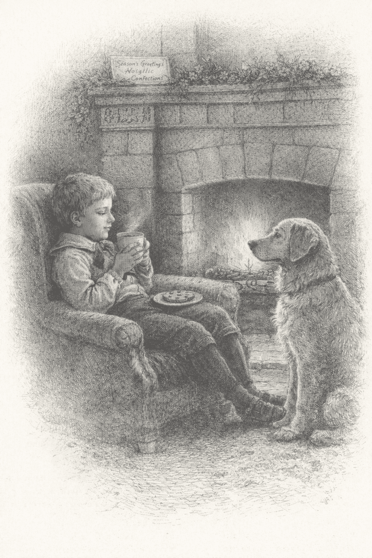
  • A woodblock-style black-and-white illustration showing a young child seated in a cushioned armchair beside a large stone fireplace. The child holds a cup with both hands and rests a small plate with food on their lap. A dog sits on the floor facing the child, positioned close to the chair. Inside the fireplace, a fire burns with visible flames and glowing embers. Above the mantel, greenery is draped along the stone surface, and a small rectangular sign rests on the mantel shelf with handwritten text that reads “Season’s Greetings Confections.” The room appears enclosed and domestic, with textured stonework, soft shading, and fine cross-hatching throughout the scene. The image is framed with a light vignette that fades into the surrounding background.

    “Child by the Hearth with Waiting Companion”

    Nothing asks to be explained. The fire speaks through light rather than motion, and the room feels shaped by repetition: evenings like this returning again and again, unchanged except by memory. The child drinks slowly, unaware of being observed, while companionship exists without demand or performance.

    The scene rests in ordinary comfort — warmth earned after cold, stillness shared rather than solitary. What remains is not nostalgia, but recognition: the small domestic rituals that quietly anchor a season.

    Image © Nostalgic Confections Creative Studio, 2026

    Studio Original (Interpretive Imagery). Editorial authorship & compilation rights. For usage context and visual standards, pair this entry with the project’s current stewardship guidance.

    Creativity & Conceptualization

    This image emerged from a desire to explore quiet companionship rather than overt nostalgia. The scene centers on a child seated by the warmth of a fireplace, holding a simple cup while a patient dog watches nearby. Instead of dramatizing the moment, the composition leans into stillness — a pause between actions where comfort, routine, and trust quietly define the relationship between the figures.

    The rendering draws inspiration from early illustrated engravings and woodblock traditions, where texture and line carry emotional weight as much as expression. Care was taken to preserve the tactile quality of the environment: the worn armchair, the soft glow of the hearth, and the delicate layering of shadow that suggests warmth without relying on color. The restrained monochrome palette allows attention to settle on posture and gesture — the child’s inward focus and the dog’s attentive calm forming a subtle dialogue.

    Rather than presenting sentiment directly, the image invites recognition through familiarity. It reflects a universal domestic moment — warmth after cold, solitude shared rather than lonely, and the quiet rituals that shape memory. The intention was to create a scene that feels remembered rather than invented, allowing viewers to supply their own histories within the space.


  • Vintage-style emblem showing a 1920s candy delivery truck filled with sweets, surrounded by decorative banners reading “Nostalgic Confections” and “Confectionally Yours.”

    “Nostalgic Confections Delivery Crest — Confectionally Yours Emblem”

    What began as a logo exercise quickly became an act of historical interpretation. The intention was never simply to design a decorative badge, but to rediscover the visual language of early American confectionery — a time when delivery trucks were ambassadors of sweetness and storefront emblems carried personality, promise, and craft. The crest grew from research into 1920s Americana, sign-painter traditions, and the ornamental optimism of the Art Deco era. Every element was chosen to feel lived-in rather than invented: the slightly storybook Ford Model A, the overflowing cargo of penny candies, and the hand-lettered banners that echo a period when typography itself was an artisan’s work.

    Ideation moved through an unusual balance of precision and play. The prompt served less as instruction and more as a conversation between eras — blending apothecary illustration, carnival exuberance, and engraving techniques with modern rendering clarity. We intentionally allowed dimensional overlap, metallic edging, and worn textures to coexist with HDR sharpness, creating an image that feels simultaneously archival and newly discovered. The goal was not nostalgia as imitation, but nostalgia as emotional recognition — something familiar enough to trust, yet vivid enough to feel alive again.

    Rendering, in this context, became an extension of storytelling. Each pass refined hierarchy and symbolism, transforming illustration into emblem: a mark capable of living on packaging, digital spaces, or a shop window without losing its narrative weight. The resulting crest represents more than branding; it reflects a philosophy of making — that thoughtful design honors memory, that craftsmanship can be translated through modern tools, and that even in a digital age, the spirit of hand-made sweetness can still be carried forward with intention and care.

    Image © Nostalgic Confections Creative Studio, 2026

    Studio Original (Interpretive Imagery). Editorial authorship & compilation rights. For usage context and visual standards, pair this entry with the project’s current stewardship guidance.